
I had a bunch of plans with people this weekend, but instead my body decided it was sick and I slept for 12 hours. When I did finally wake up, I felt better, and I figured I’d try to be productive. One thing I knew I wanted but hadn’t figured out yet was a logo. When I came up with the name Turtle Haven, I figured I could combine the T and the H somehow like you see in so many fancy logos on billboards and stuff. Then I had the brilliant idea to have the letters also take the shape of a turtle. I spent about an hour scribbling in an old notebook before I came up with a basic design that didn’t look like Boba Fett or a tie fighter.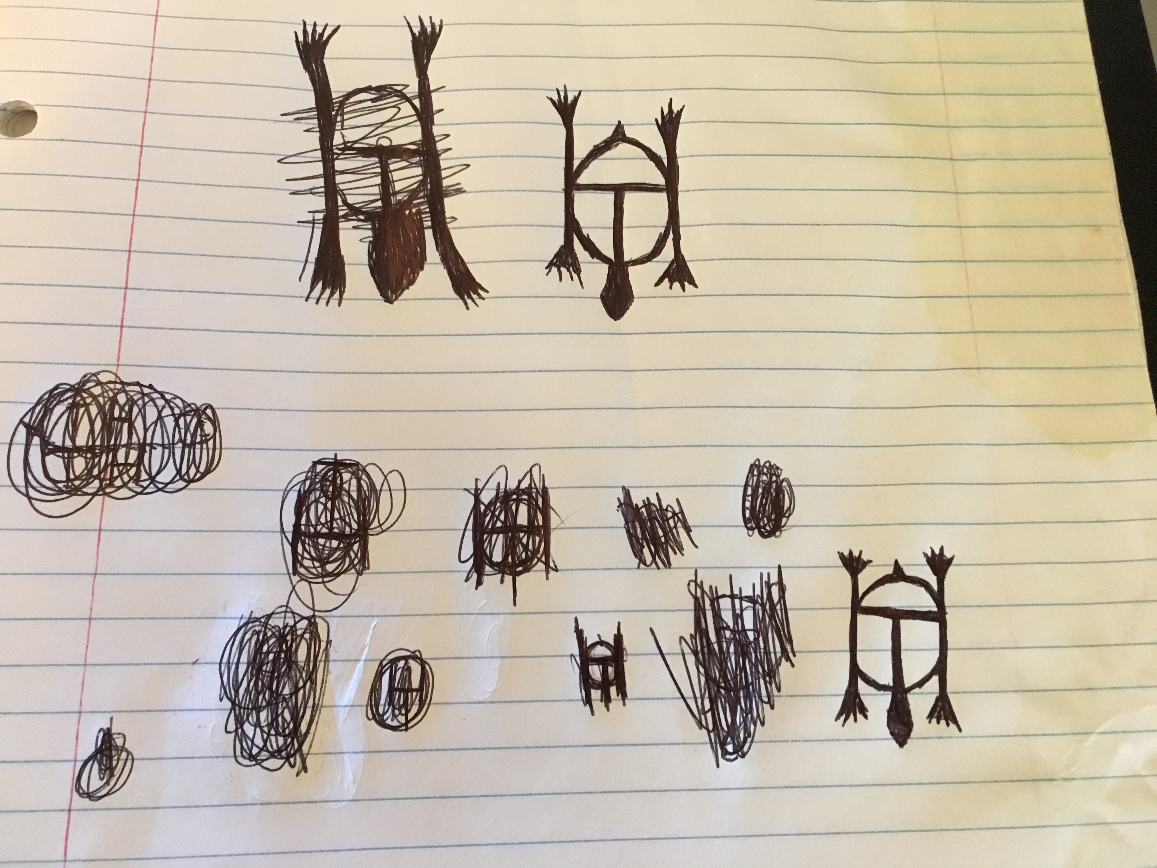
Then I knew I had to make it digital so that I could put it on my website, social media, etc. I have a number of artist and graphic designer friends who are wizards of photoshop, indesign, etc., and I know I could have asked one of them to do it for me, but I wanted to try it on my own first. There were a few reasons for this: 1-I know I can be particular and I didn’t want to annoy my friends being nit-picky with the art. 2-If I didn’t like it, I wanted nobody to blame but myself. 3-Bobby had gotten me a refurbished laptop for Christmas to replace my over-a-decade-old one that was really starting to get slow, and I wanted to see if I could use my newly capable personal technology to create something.
I know there are a bunch of free and open source editors out there, so I looked up some of the ones I’d heard of before and compared them to new ones, and the one I wound up going with was Krita. I’ve used a few others and none of them were intuitive. The most I’m usually asked to do at my job as far as designing goes is making flyers on Publisher, which is very drag-and-drop intuitive, with obvious limitations as far as true design work goes. I downloaded Krita and read the first few pages of the instruction manual, but there was so much stuff that I knew I probably would never use especially making a logo with simple shapes, so eventually I gave up and just started messing around with it. I had to get used to working with separate layers, drawing with my mouse instead of a pencil, and having to select what I want my cursor to do at every single juncture.
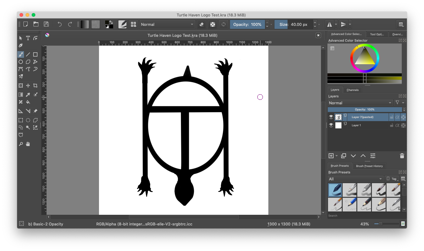
My husband knows a bit about photo editing, and he was able to help me find the right places to look for the commands that I knew had to be there somewhere. He also lent an eye and sometimes a hand to touch up details. The claws were the biggest pain in the ass. I had to make them look real enough to know that they’re part of the turtle in the logo and not a palm tree or something, but also not too realistic so that they weren’t out of place with the rest of the logo being cartoony and simplistic. It took me all day, and I frequently got frustrated and had to do other things (like clean out more of the cellar and add another turtle recovery tank), but I did eventually get a logo that I’m pretty happy with. I decided to keep it black and white for now. As the saying goes, “Keep it simple, stupid.” But I do know that Krita is more than capable of making it all sorts of pretty if I do decide later that I want to mess around with it.
And now, I have an official logo for Turtle Haven!

It’s excellent and good logos usually take much more time. Kudos!
LikeLike